In a previous post I described how I created the headline text for workshop notes. I was aiming for a cut paper look. I used Illustrator to stack three copies of the title each with a different colour and different line width. It worked well but was difficult to edit. As so often in Illustrator and Photoshop there is a better way! Using the Appearance palette its possible to add more than one outline to a shape and arrange the order that they are displayed. Here's how its done.
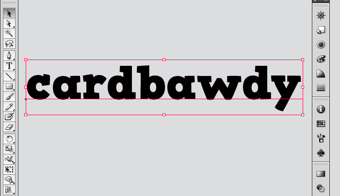
Type the text that you are working with over the top of a locked grey rectangle. This is 30pt text using the font HVD Comic Serif Pro.
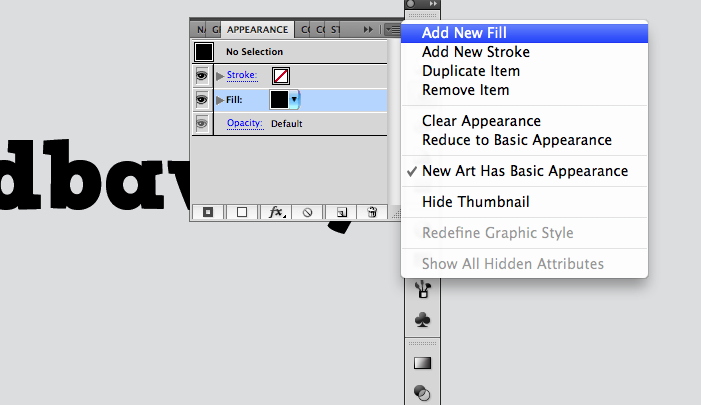
With the text selected, open the Appearance palette (Windows -> Appearance) and click on Add New Fill
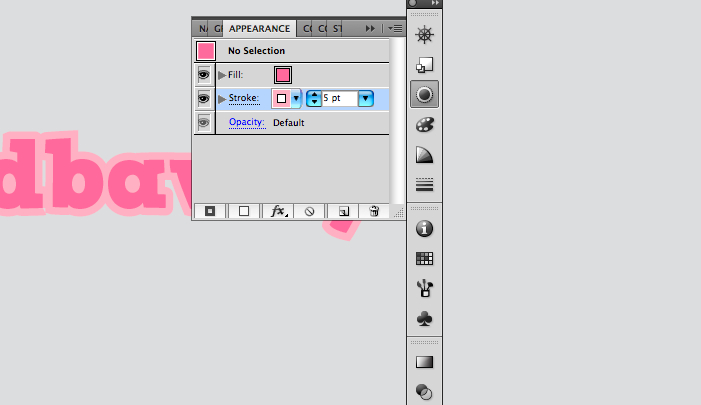
Select an appropriate colour for the fill (This is M65 Y15)
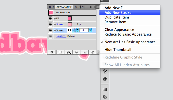
Next click on Add New Stroke, set the colour to M40 Y10 and the width to 5pt. Add another stroke and set it to white and 8pt. Drag the strokes down below the fill in the Appearance Window so that they are in the order shown above.
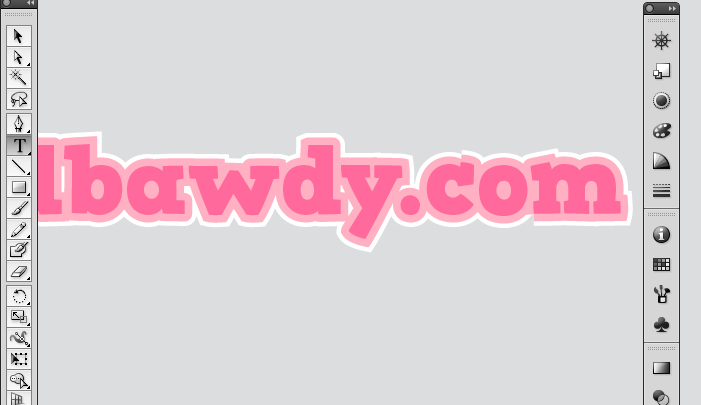
That's it. Really easy – and it's still editable. And that is why I love Illustrator.
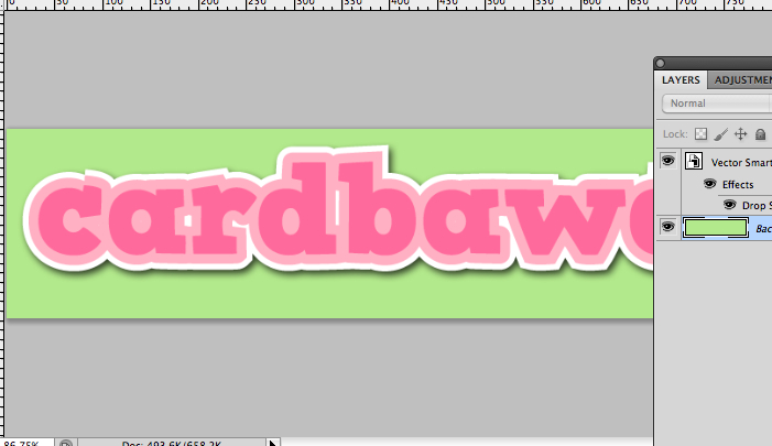
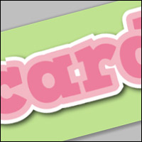
I finished the picture off by dropping it into Photoshop and adding a drop shadow.
Cool.