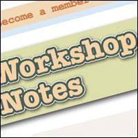
Here's a quick run through of how I created the new Workshop Notes ribbon that runs across the front page. I hope you find it useful/interesting.
I was aiming to create a cut paper look for the text. As if the words had been cut out from paper and pasted into place.
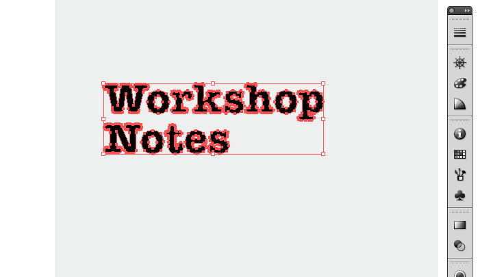
Starting in Illustrator, type out the word. I've used 50pt American Typewriter font. Convert the text into outlines. This isn't strictly necessary but it does make it easier to move things around as the bounding box (the red rectangle in the picture above) is more accurately placed
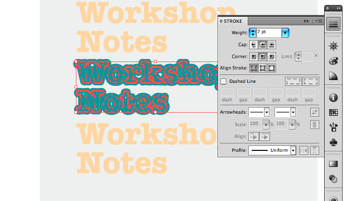
Create two more copies of the text by <alt> dragging them. Add an outline to the second copy. I used a 7pt line in a dark green. Notice that the Corner setting in the stroke palette needs to be set to curved otherwise you'll end up with weird pointy bits sticking out of the text!
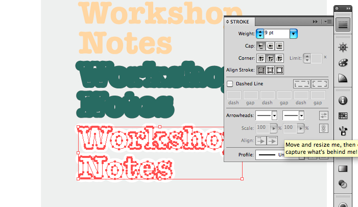
Set the stroke of the third copy to white and 9pt
Stack these three one on top of the other. Use the arrange menu if necessary to get the stacking order right. Once done, group them all together by selecting them and choosing Object -> Group
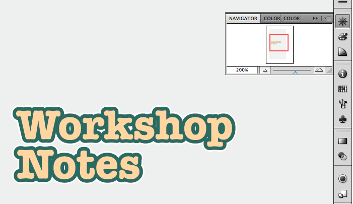
Drag the result into your waiting PhotoShop file as a smart object and resize it as appropriate.
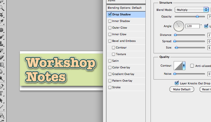
Compete the effect by adding a small drop shadow in the layers effect palette.
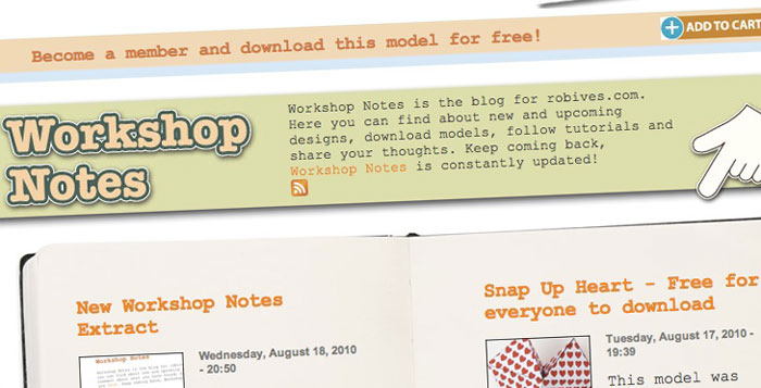
Save the result – done! This technique will work equally well in your paper models, it's great for titles and labels. Quick and easy but quite effective.